
Lightning Data Service In LWC In Salesforce
Lightning Data Service maintains a client-side cache of record data that has been loaded via a wire adapter. Loading data from this cache is faster than requesting it from the server. Lightning Data Service re-requests the record data from the server to satisfy requests that occur after the cache lifetime.
Beneficial:-
- Reduce server load, database load, and network transfer by fetching data once.
- No need to write Apex Code or SOQL query
- Support most standard and all custom object
- Share cache data across components
- Support field level security and sharing rules so no need to worry about data security and visibility
- Support CRUD operations
Limitations:-
- Can not use for Vf pages
- No bulk support
lightning:recordForm
lightning:recordForm is less customizable. To customize the form layout or provide custom rendering of record data, use lightning:recordEditForm (add or update a record) and lightning:recordViewForm (view a record).
Use lightning:recordForm to create record forms is easier than building forms manually with lightning:recordEditForm or lightning:recordViewForm. The lightning:recordForm component provides these helpful features:
The lightning:recordForm component provides these helpful features:-
- Provides default Cancel and Save buttons in edit forms
- Loads all fields in the object’s compact or full layout, or only the fields you specify
- Uses the object’s default record layout with support for multiple columns
- Switches between view and edit modes automatically when the user begins editing a field in a view form
The objectApiName attribute is always required, and the recordId is required only when you’re editing or viewing a record.
lightningRecordForm.html
<template>
    <lightning-card  variant="narrow" icon-name="standard:contact">
      <h1 slot="title">Contact</h1>
       <lightning-record-form
        record-id= {recordId}
        object-api-name={objectApiName}
        layout-type="Full"
        mode="view"
        columns="2">
      </lightning-record-form>
    </lightning-card>
</template>- Record-id: It accepts the object record id.
- Object-api-name: Here we need to pass the object api name like Account,contact etc.
- Layout-type: full or compact
- Mode: View,readonly and edit.
lightningRecordForm.js
import { api, LightningElement } from 'lwc';

export default class LightningRecordForm extends LightningElement {

    @api objectApiName='Contact';
    @api recordId='0037F000029COXHQA4';

}
lightningRecordForm.js-meta.xml
<?xml version="1.0" encoding="UTF-8"?>
<LightningComponentBundle xmlns="http://soap.sforce.com/2006/04/metadata">
<apiVersion>55.0</apiVersion>
<isExposed>true</isExposed>
<targets>
<target>lightning__RecordPage</target>
</targets>
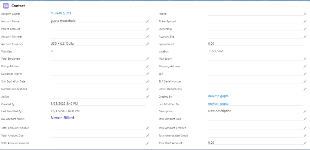
</LightningComponentBundle>complete view of the contact record
Lightning record form with Create view:-
For create view we need to remove only record Id from lightning record form
<template>
    <lightning-card  variant="narrow" icon-name="standard:contact">
      <h1 slot="title">Contact</h1>
       <lightning-record-form
        object-api-name={objectApiName}
        layout-type="Compact"
        columns="2">
      </lightning-record-form>
    </lightning-card>
</template>
Lightning Record Form with Selected Fields: – Instead of full and compact layout we can mention specific fields that’s we wants to display
<template>
    <lightning-card  variant="narrow" icon-name="standard:contact">
      <h1 slot="title">Contact</h1>
      <lightning-record-form object-api-name={objectApiName}
        fields={fields} onsuccess={handleSuccess}>
    </lightning-record-form>
    </lightning-card>
</template>
import { api, LightningElement } from 'lwc';
import { ShowToastEvent } from 'lightning/platformShowToastEvent';
import FNAME_FIELD from '@salesforce/schema/Contact.FirstName';
import LNAME_FIELD from '@salesforce/schema/Contact.LastName'
import EMAIL_FIELD from '@salesforce/schema/contact.Email';
export default class LightningRecordForm extends LightningElement {
@api objectApiName='Contact';
fields = [FNAME_FIELD,LNAME_FIELD,EMAIL_FIELD];
handleSuccess(event) {
const evt = new ShowToastEvent({
title: "Contact created",
message: "Record ID: " + event.detail.id,
variant: "success"
});
this.dispatchEvent(evt);
}
}
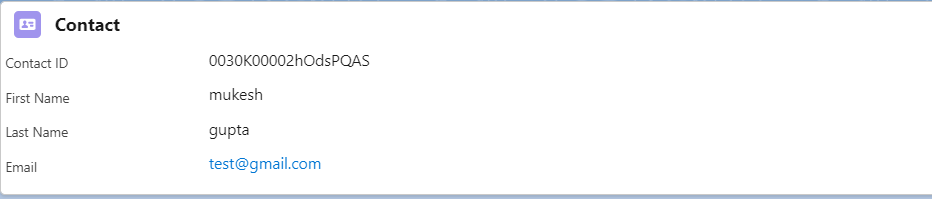
Lightning-record-view-form
Lightning-record-view-form is the component to show the salesforce record in the form of read only.Lightning record view form requires the record-id and the object-api-name in its attribute.This automatically controls the field level security and the sharing settings.
To show the records in the layout it uses the lightning-output-field component with field-name attribute.
<template>
    <lightning-card  variant="narrow" icon-name="standard:contact">
      <h1 slot="title">Contact</h1>
      <lightning-record-view-form record-id= {recordId} object-api-name= {objectApiName}    >
        <div class="slds-grid">
           <div class="slds-col slds-size_1-of-2">
               <lightning-output-field field-name="Id"></lightning-output-field>
               <lightning-output-field field-name="FirstName"></lightning-output-field>
               <lightning-output-field field-name="LastName"></lightning-output-field>
               <lightning-output-field field-name="Email"></lightning-output-field>
           </div>
        </div>
       </lightning-record-view-form>
    </lightning-card>
</template>
import { api, LightningElement } from 'lwc';
export default class LightningRecordForm extends LightningElement {
@api objectApiName='Contact';
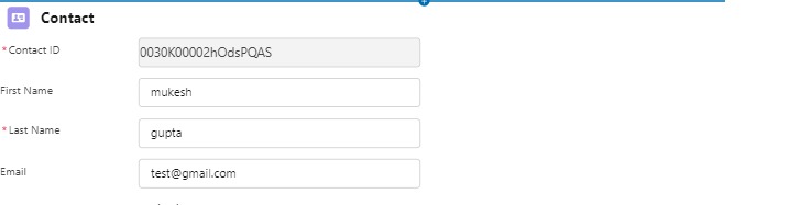
@api recordId = '0030K00002hOdsPQAS';
}
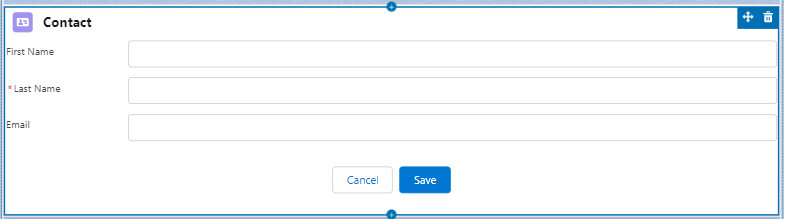
Lightning-Record-edit-form
Lightning-record-edit-form implements the LDS and does not require any apex class to execute the backend process.
Lightning-record-edit-form component is used to create or edit the salesforce object record.This shows the labels of the field with the pre-existing value. Lightning-record-edit-form components also maintain the field level security and the sharing setting. To specify the editable field it uses the lightning-input-field component.
<template>
    <lightning-card  variant="narrow" icon-name="standard:contact">
      <h1 slot="title">Contact</h1>
      <lightning-record-Edit-form record-id= {recordId} object-api-name= {objectApiName}    >
        <div class="slds-grid">
           <div class="slds-col slds-size_1-of-2">
               <lightning-input-field field-name="Id"></lightning-input-field>
               <lightning-input-field field-name="FirstName"></lightning-input-field>
               <lightning-input-field field-name="LastName"></lightning-input-field>
               <lightning-input-field field-name="Email"></lightning-input-field>
           </div>
        </div>
       </lightning-record-Edit-form>
    </lightning-card>
</template>
import { api, LightningElement } from 'lwc';
export default class LightningRecordForm extends LightningElement {
@api objectApiName='Contact';
@api recordId = '0030K00002hOdsPQAS';
}
Now talk about differences between three
| lightning-record-form | lightning-record-view-form | lightning-record-edit-form |
|---|---|---|
| view, create, and edit records with very less coding. | Create customizable record display forms with read-only mode. | Create customizable record edit, view forms. You can also add some read-only fields. |
The record-id is required in the edit mode | The record-id is required to load the record | The record-id is required to load an existing record. |
| No additional apex class required to load/create/update a record. | No additional apex class required to load a record. | No additional apex class required to load/create/update a record. |
The mode attribute is requiredview – used to load the recordedit – used to edit/create the recordreadonly – record is opened in read-only mode | The record is always opened in the read-only mode. | The record is always opened in the edit mode. |
The layout-type attribute is used to specify a Full or Compact layout. The fields configured by admin in the layouts are auto rendered on the form.Full – all fields configured on the full page layout of the record are rendered.Compact – all fields configured on the compact layout are rendered. | No fields attribute. Fields are rendered using lightning-output-field component nested inside the lightning-record-view-form | No fields atttribute. Fields are rendered using lightning-input-field component nested inside the lightning-record-edit-form |
The fields attribute is used to mention a list of fields to be rendered. | ||
| Save and Cancel buttons are added automatically | Need to add a button with the submit to save the record. Also a cancel button is needed which can call the reset() function. | |
lightning-record-form does not support prepopulating of the fields when the form is loaded | Use the value attribute on lightning-input-field to prepopulate the field value. | |
| Does not support custom UI level validations | You can add custom UI level validations on the lightning-input-field components. | |
| You can’t add custom elements | You can add custom elements to display fields | You can add custom elements to display/update fields |